Kanban Zone
PRICING PAGE REDESIGN

The Right Plan, Made Simple: A Pricing Page UX Overhaul
Kanban Zone is a project management platform that helps teams collaborate using visual workflows grounded in the Kanban methodology. I led the redesign of their pricing page to improve clarity, increase subscription conversions, and test the ideal moment to introduce premium add-on features. This project focused on simplifying plan comparison for users across Personal, Business, and Enterprise tiers, with a goal of driving informed decisions and boosting overall customer engagement.
Role
UX Designer
Research
Prototyping
Team
CEO - Stake Holder
Sr. Graphic Designer
4 Product Designers
Timeline
3 weeks
Tools
Figma
Miro
Kanban Zone
Challenge
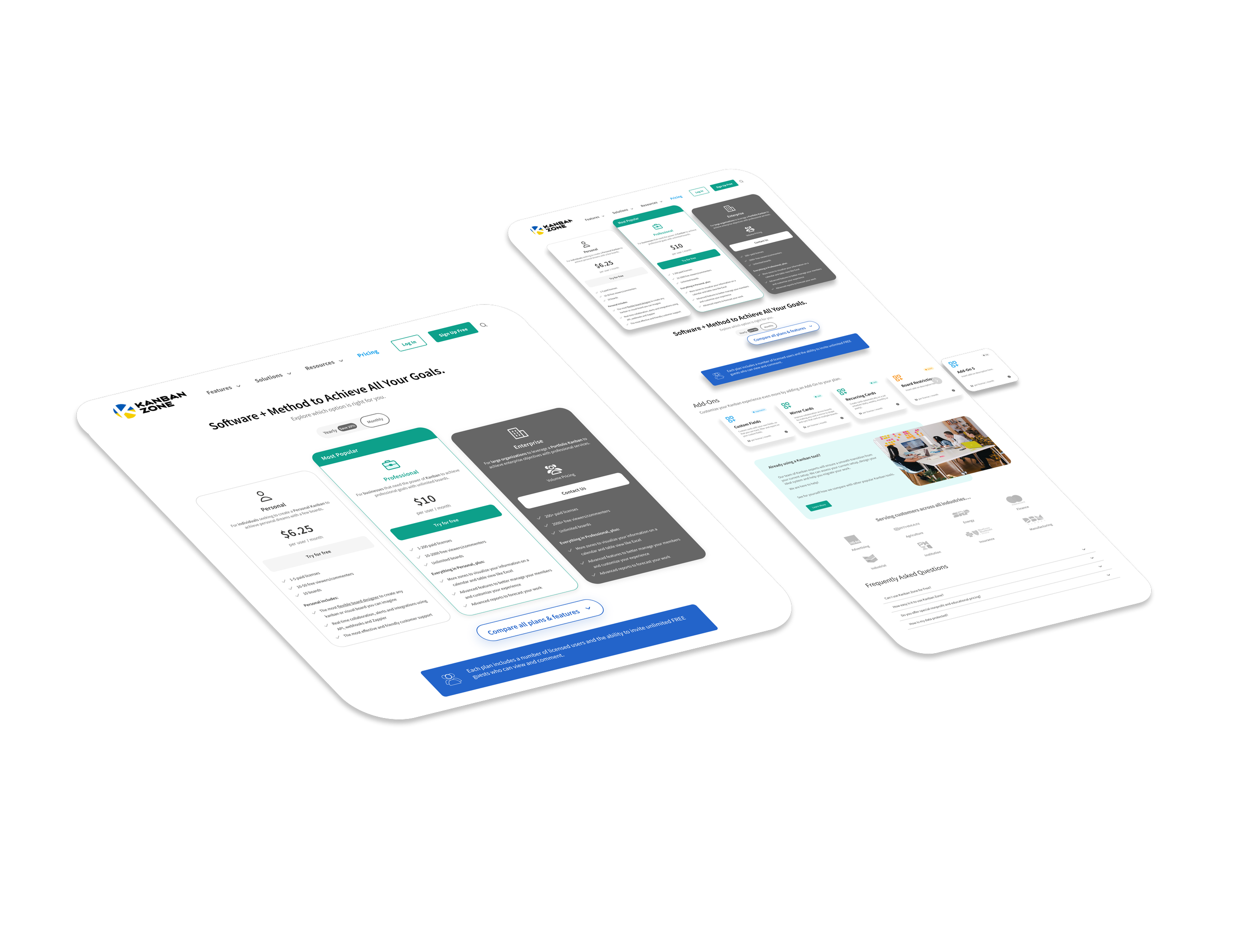
The existing pricing page created confusion for users due to unclear plan distinctions and overly wordy descriptions. Users struggled to understand the value of each plan, leading to hesitation in decision-making. The redesign aimed to simplify plan comparisons, clarify feature offerings, and present value in a more concise and visually digestible format.
Solution
To address user confusion and improve overall usability, we redesigned the pricing page with a clearer structure and a more intuitive layout. Each plan now features a concise summary of included features, helping users easily compare options without being overwhelmed by lengthy descriptions. To guide users toward confident decision-making, we introduced a “Most Popular” label on the plan most frequently chosen by others. This use of social proof provides reassurance and serves as a helpful reference point, especially for new or unsure users.
To further enhance usability, we implemented a collapsible full feature list beneath each plan. This allows users to explore Kanban Zone’s offerings in greater detail at their own pace, without cluttering the primary view. The result is a cleaner, more organized interface that supports both quick comparison and deeper discovery, tailored to different user needs and levels of familiarity with Kanban methodologies.
Impact
The redesigned pricing page significantly improved user engagement and clarity, leading to a smoother decision-making process. Users were able to quickly understand the differences between plans, resulting in increased confidence and a reduction in support inquiries related to pricing confusion. Highlighting the “Most Popular” plan drove more consistent plan selections, while the collapsible feature list empowered users to explore details without feeling overwhelmed. Overall, the company saw an increase in plan conversions and a more informed user base, ultimately supporting stronger customer retention and satisfaction.
Challenges
As we dove into the project, we quickly realized our team faced several significant challenges:
Unclear pricing page
Uncertainty of what each plan offers
Wordy and lengthy descriptions of features
Team’s limited knowledge of Kanban
These challenges reflected Kanban Zone’s need to increase conversion rates to help pull in more business. I was excited by the opportunity to show how we could achieve this.

Kanban’s current pricing page experience with limited information and wordy descriptions

Approach and Methodology
To rapidly align the team and leverage internal expertise under tight timelines, we adapted the Design Sprint into a Kanban Method. We focused on understand, sketch, and decide phases. We were confident that tailoring the Design Sprint would allow us to:
Gather existing customer insights and identify past efforts
Accelerate the team’s learning curve by using the Kanban Method
Make rapid decisions to move forward despite uncertainty
Focusing on defining the value of their pricing page
We facilitated collaborative workshops through Kanban Zone’s software to organize our progress on each phase, from sketch solutions to a defined roadmap.
Discover & Understand
Paint points and needs
To improve the site's conversion rates, we began by aligning the business objectives with user expectations. We conducted interviews with a diverse range of users—including project managers and business owners—to uncover their goals, pain points, and decision-making behaviors. These insights helped us identify key opportunities where user needs and business goals overlapped, forming the foundation for data-driven design decisions that support conversion growth.
“What do each of these features do?”
“I want to make sure i’m able to organize my team to keep on track”
“I’m not sure right away what each plan offers..”
Discover & Understand
Paint points and needs
During our discovery to understand what improvements could be made to Kanban Zone to improve the CX. We provided 3 tasks for our users to complete:
Find the best plan for your needs: 65% completed task
Find the features of each plan: 70% completed task
Understood the costs: 100% completed task
With these findings in mind we wanted to understand what user’s were feeling and what information they wanted to improve their choice selection.
Usability interviews of original plan
“What’s the difference between each plan? I don’t really know right away which one would be best for me”
During our interviews we found a common pain point from our users, what does each plan offer for them. With this is we thought “How might we make it easier for user’s to know which plan is best for them.”
Explore & Ideate
Solution Sketches & Wireframes
Using our "How Might We" (HMW) statements as prompts, we initiated the ideation phase by sketching and wireframing a wide range of potential solutions. Each concept was designed to directly address the core user challenges we identified during research. This approach helped us explore multiple directions quickly, align on key design priorities, and ensure our solutions remained grounded in user needs.


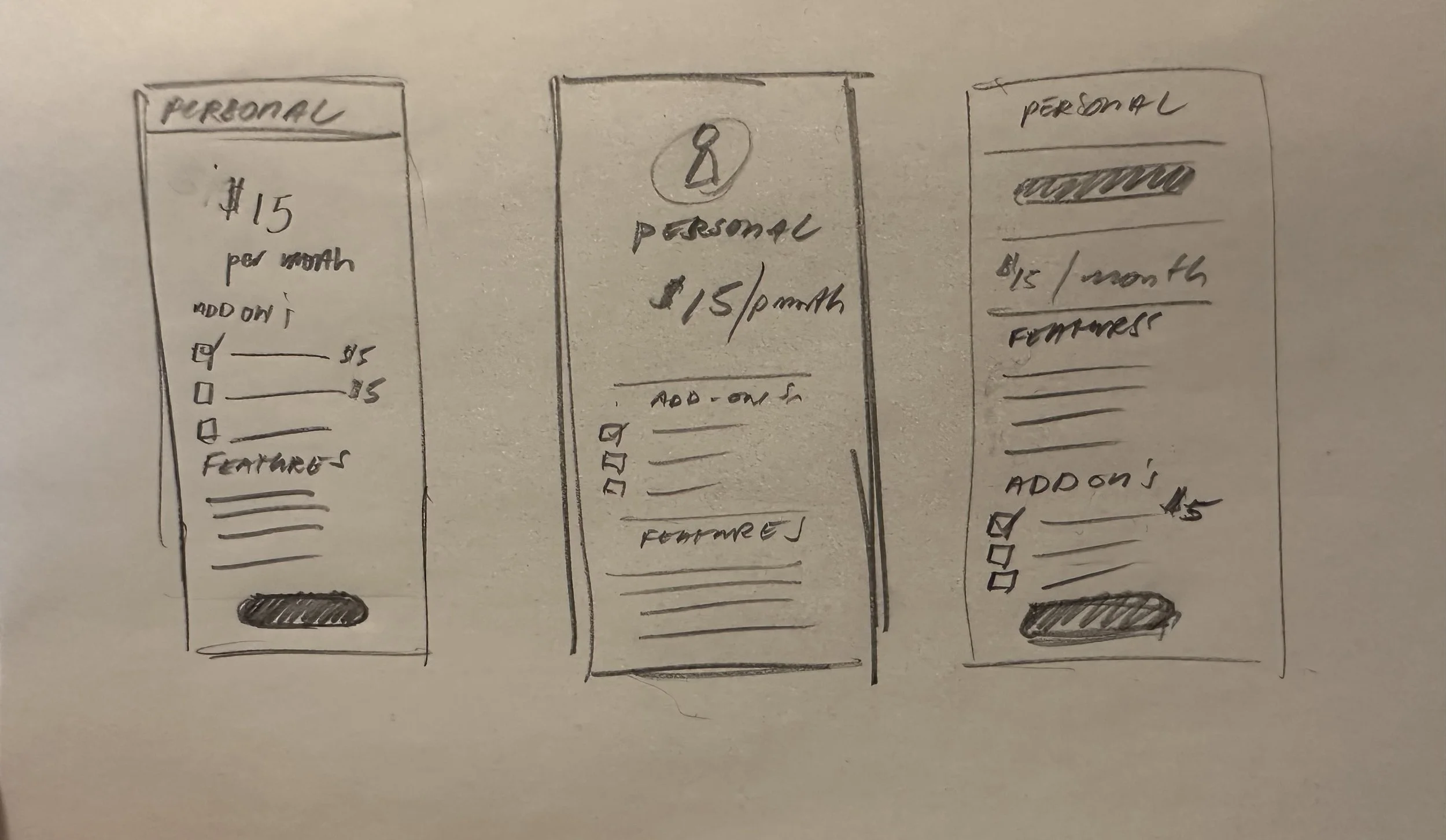
Lo-fi wire-frames and sketch variations for different plans with add-ons
Discover & Understand
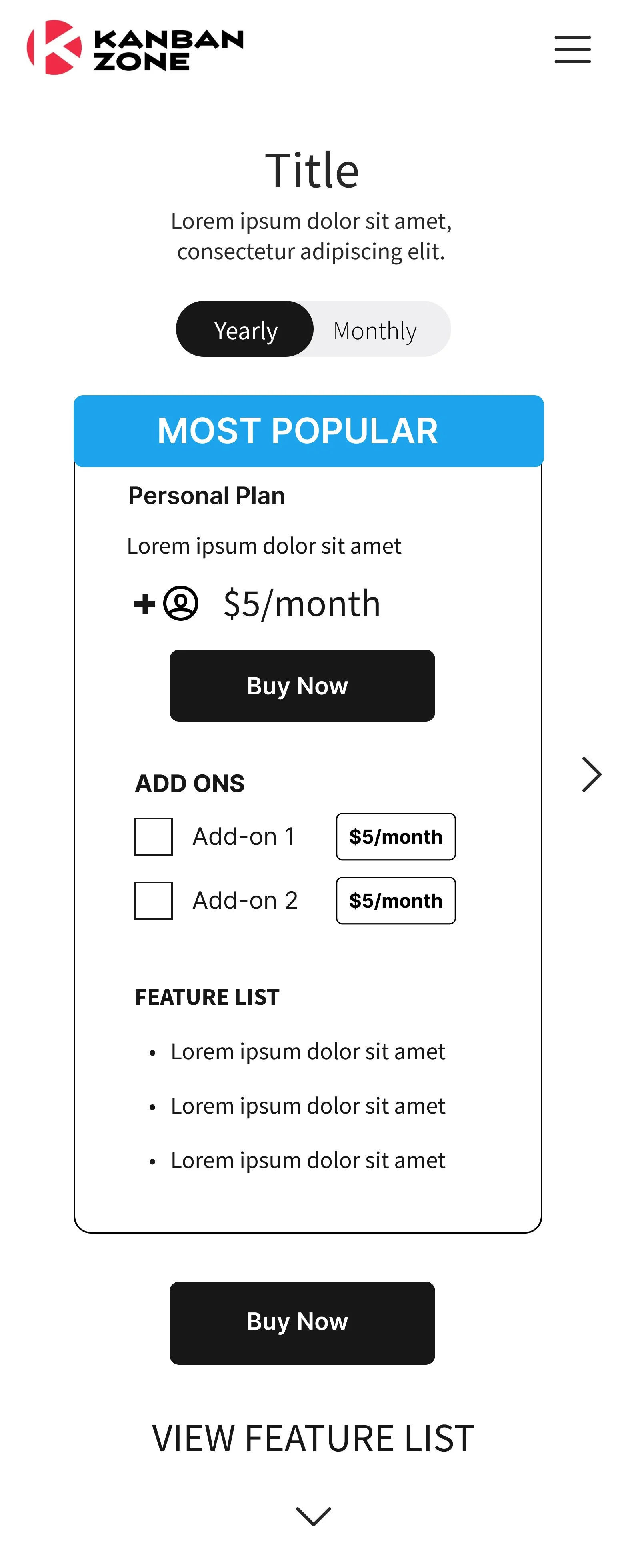
Usability Testing Lo-Fi
To assess the effectiveness of our pricing page, we conducted usability testing to evaluate whether users could easily identify the plan that best suited their needs. We presented three options—Personal, Business, and Enterprise—each accompanied by a clear breakdown of features and pricing.
The results were encouraging: most participants easily understood the differences between plans and confidently selected the one that aligned with their needs. The clarity of the feature comparison was frequently cited as a positive factor in their decision-making.
We also tested the placement of the add-on feature, comparing its presence during initial plan selection versus later in the user flow. Feedback was mixed—some users appreciated the ability to customize their plan upfront, while others found it overwhelming at that stage and preferred to choose add-ons after selecting a core plan.
These insights highlighted the need for a more flexible or contextual presentation of add-ons, potentially offering users the option to skip and revisit them later in the workflow.

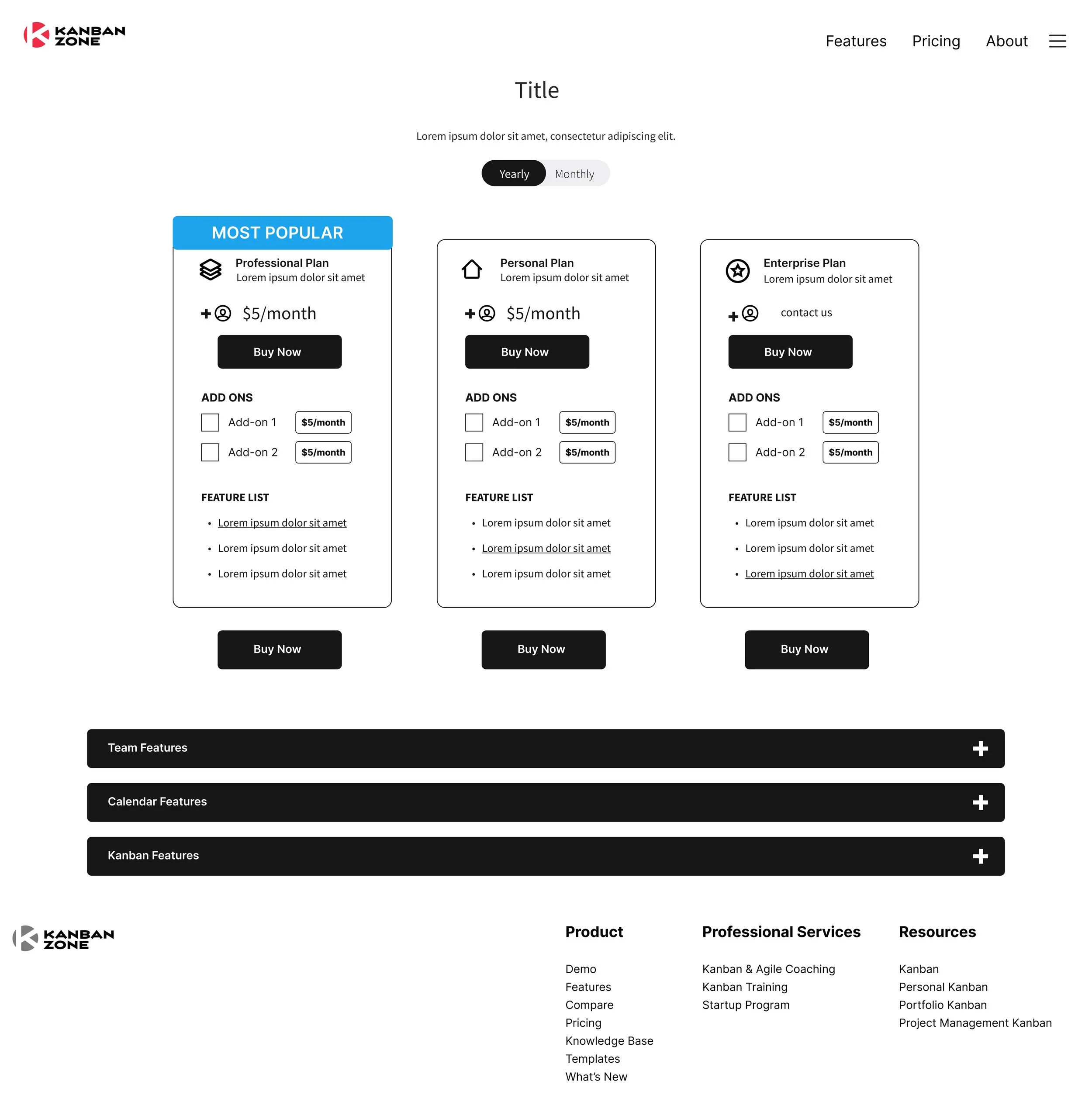
Enhancing Plan Differentiation to Guide User Selection
In response to user feedback highlighting confusion between plan tiers, we implemented visual design enhancements to clearly differentiate plans and strategically highlight our target offerings—Professional and Enterprise.
Applied a distinct Call-to-Action (CTA) and border color to the Professional and Enterprise plans, helping them visually stand out on the page.
Darkened the Enterprise plan’s color scheme to emphasize its prominence and reflect its popularity among power users and larger teams.
These adjustments provided stronger visual hierarchy and directional cues, guiding users toward the most relevant options while improving clarity and overall navigation.

Enhancing Mobile Navigation with Swipe Cues for Improved Plan Discovery
To address user confusion when viewing plan options on mobile, we implemented two key design solutions:
Partial visibility of adjacent plans to visually suggest horizontal scroll behavior and indicate additional content beyond the viewport.
A swipe indicator (carousel dots) placed below the plan cards to reinforce the affordance of horizontal navigation.
These subtle yet effective cues aligned with mobile UI patterns and improved discoverability.

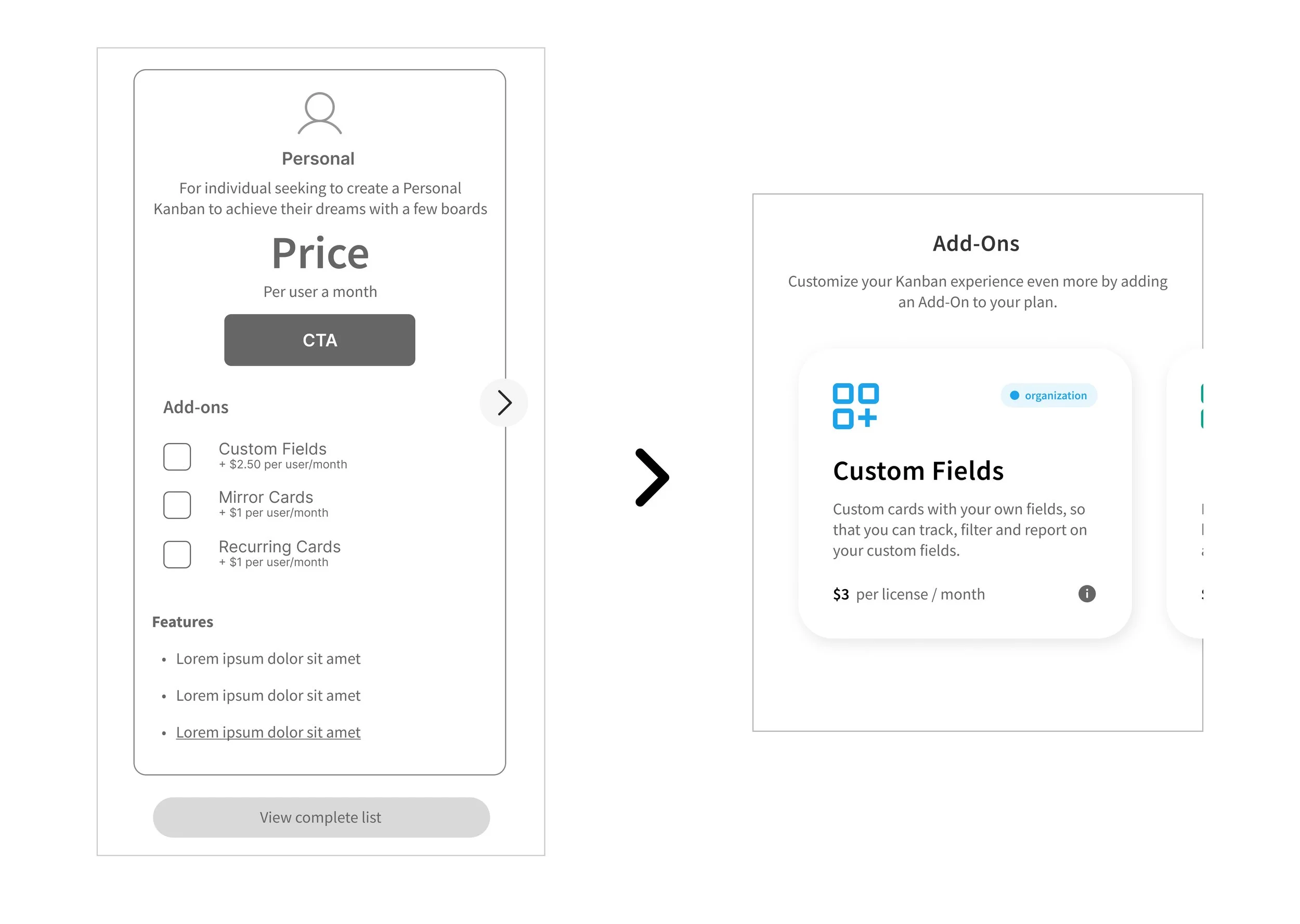
Empowering User Choice Through Flexible Add-On Visibility
To reduce user hesitation around the value and pricing of add-ons, we introduced a dedicated featured add-ons section within the pricing page. This section clearly outlined the purpose, benefits, and use cases of each add-on using concise copy and visual hierarchy, reducing cognitive load during decision-making.
We also highlighted that add-ons could be added at any time—before or after plan selection—giving users control over how and when to customize their subscription. This flexibility helped ease commitment pressure during checkout.
Uh-Oh
Due to a sudden shift in priorities, the CEO requested the project be finalized a week early and made ready for immediate launch. While we strongly recommended conducting usability testing on the high-fidelity design, the decision was made to push it live without further validation. In response, we quickly prioritized key features based on prior user feedback and research insights. This allowed us to move forward confidently, balancing speed with user-centered decision-making to deliver a functional and thoughtful design under pressure.
Most popular plan
Introducing a "Most Popular" plan can indeed aid users in decision-making by leveraging social proof. This plan, highlighting features preferred by others in their field, serves as a convenient reference point for users, enhancing their confidence in selecting the most suitable option.

Simplified plan's & features
We can simplify the plans and features presentation by:
Clearly outlining features: Provide a concise overview of features included in each plan.
This approach enables customers to swiftly assess the available plans and their corresponding features, facilitating faster decision-making.


Most popular plan
Introducing a "Most Popular" plan can indeed aid users in decision-making by leveraging social proof. This plan, highlighting features preferred by others in their field, serves as a convenient reference point for users, enhancing their confidence in selecting the most suitable option.
Results Summary
The redesigned pricing page delivered a more intuitive and user-friendly experience, as reflected in qualitative feedback from usability testing and internal reviews. Users consistently reported improved clarity when comparing plans, with concise feature descriptions making it easier to understand the value of each option. The addition of the “Most Popular” label helped guide decisions, and the flexibility to add features later reduced pressure during the initial selection process.
One participant shared, “This feels much easier to understand than before—like I actually know what I’m signing up for.” Another noted, “Being able to swipe through plans on mobile is way more natural now—I didn’t even know there were other plans before.”
Although specific metrics were not disclosed, the CEO—our primary stakeholder—confirmed a positive increase in performance indicators post-launch and expressed satisfaction with both the quality of the design and the team's ability to adapt under tight deadlines. This feedback validated the success of the redesign in meeting business goals while enhancing the user experience.
Future Recommendations
Although we had to deliver the design ahead of testing, we were later able to conduct usability tests on the version presented to the CEO. Based on user feedback, we identified two key opportunities to further enhance the pricing page experience:
Relocate the Add-On Section to the Checkout Flow
Users expressed confusion about when and how to select add-ons, unsure if they needed to decide immediately or could defer the choice. Moving the add-on selection to the checkout process would streamline the user journey and provide clearer context for making customization decisions.Improve Color Accessibility
The current primary green used on the site does not meet WCAG contrast guidelines (minimum 4.5:1 for normal text). Exploring accessible color alternatives will ensure a more inclusive experience, particularly for users with visual impairments, and support broader compliance with accessibility standards.
